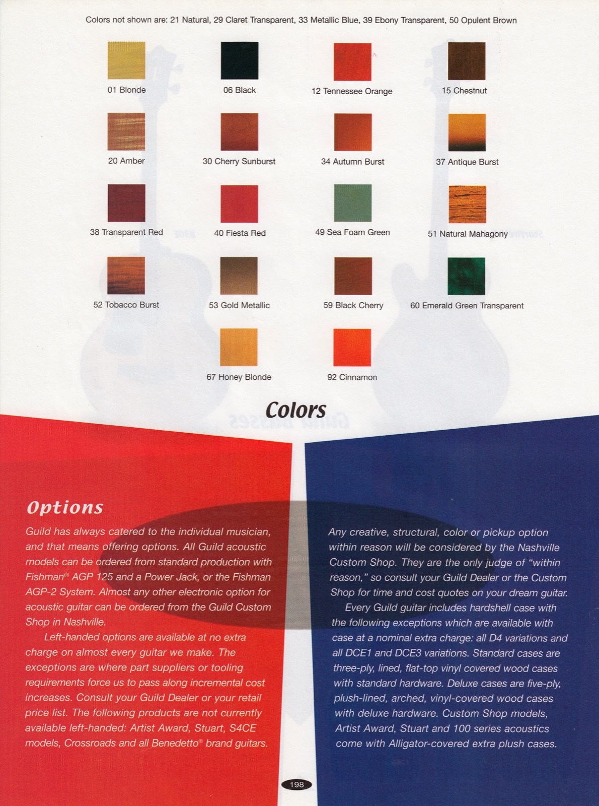
The ones in the catalog look like they have a nice even strip of dark all around the edge.
I was always sure the real problem was with the actual printing process exaggerating just how dark the edges of the bursts (the Tobacco in particular) actually are.
Has to do with "dot count" in the "screen" used to create the different plates for each color. Lower dot count means less resolution so less ability to show fine graduations, but it's cheaper, of course.
Oh, another thing: "Dot gain": as the dots of ink dry they spread a bit, they get a little larger so in the case of the black dots they can begin to look like a solid. Better coatings minimize the dot gain, cheaper ones, not so much.
The biggest problem with that era of catalog is that the pages are tissue thin and color bleeds through from the other side when scanning due to how my scanner works. I could probably make them better by photographing each page on a pure black background. But I'm not gonna.

Coming from the printing paper supplier industry, I can say that my '96 Catalog and the First Guild Gallery are printed on appropriate thickness stock, also the paper used is good quality coated which helps color stand out in 4-color process and gives some opacity in its own right.
The Fender Frontlines for sure are thinner due in part at least to their page count and a cost target and probably do show some "transparency" especially if your scanner backlights the pages. There's only so much that can be done when the coating starts weighing more than the paper as you noted with the "tissue thin" comment.
Printers hated it too, it wrinkled easily on press.
And the best pic of the Cherry Sunburst is in fact in the "'97 Electrics" catalog, when they were still using good paper, and probably higher-density screens:
I'd say early on in the game Fender was paying the nominal increased cost to provide high-quality catalogs, but the cost of paper started going up pretty quickly in the late '90's, too.
For comparison everything I've explained is glaringly evident in the finish color chip charts in the Fender Frontlines,
especially the "screen resolution" (meaning the printing plate screen):