Archie
Junior Member
- Joined
- Dec 9, 2021
- Messages
- 84
- Reaction score
- 214
- Guild Total
- 3
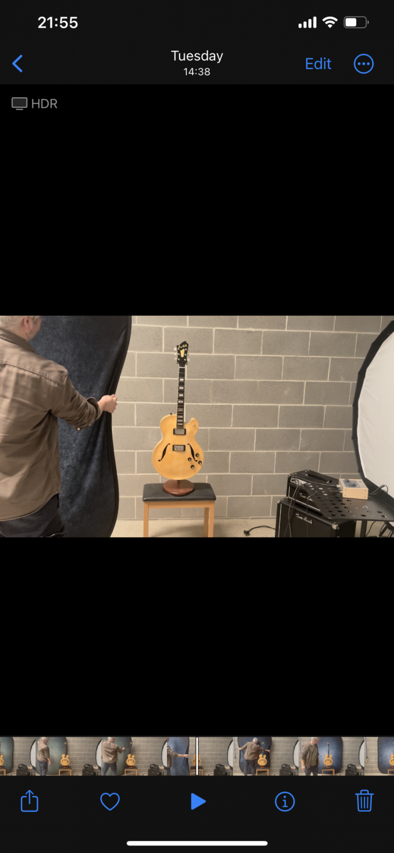
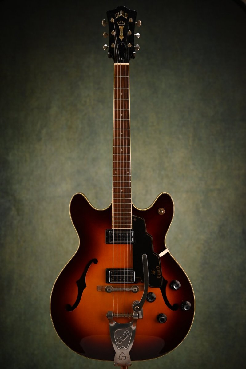
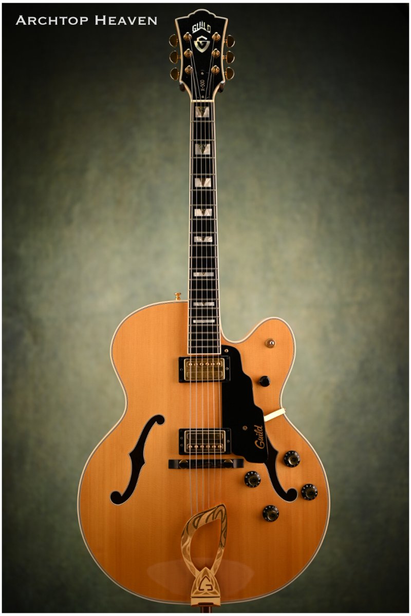
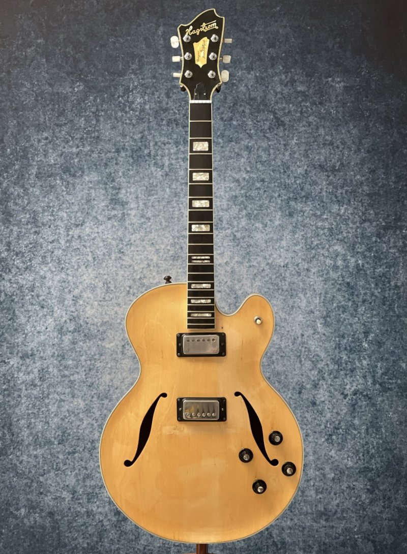
I like modern backdrops but Manfrotto had a sale and so i bought this double sided, vintage style pop up. Since paper backdrops have been driving me crazy, what with creasing and the tube sagging in the middle, ruining a whole role, I thought a more resilient material might work.
My only issue is they look a bit cheesy to me. I prefer the clean modern look of a one colour (normally light grey) backdrop.
That being said, I’m not 100% against this new backdrop.
What’s the verdict here?
My only issue is they look a bit cheesy to me. I prefer the clean modern look of a one colour (normally light grey) backdrop.
That being said, I’m not 100% against this new backdrop.
What’s the verdict here?
")